Happy New Year, reporters! It’s time to look back on the most popular and influential tools I shared this year. We’ll start, as always, with my customary, mediocre Canva branding:
This year has taken me from hardware printers to cutting edge AI to old school accessibility. Here are this year’s winners.
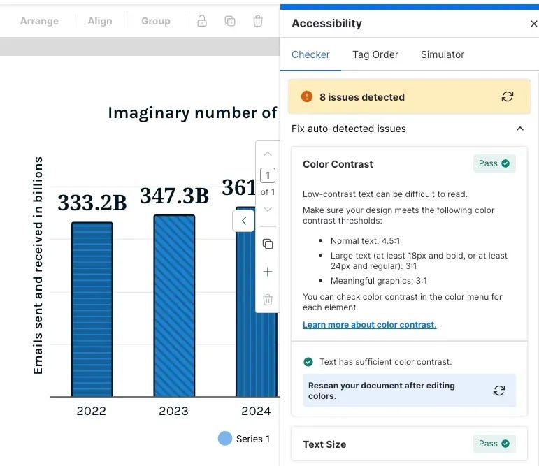
I was pleased to see that my most “liked” post on Substack was on making illustrations accessible. It was also my very first post of 2024. Venngage is a tool that prioritizes accessibility when helping you design data visualizations.
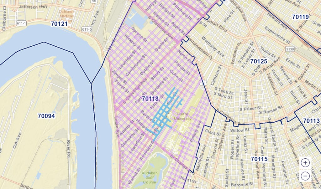
A crowd favorite was the USPS mail routes. If you are in the US (and maybe in some other countries), you can hire a friendly neighborhood postman to hand out something along his route. This could be advertising for your story, callouts, requests for tips, anything.
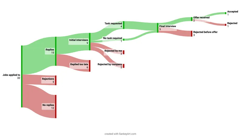
A surprise frontrunner was “Visualize Change with a Sankey Chart.” I have to admit, I had no idea sankey charts would be such a draw. In any case, I think they are a neat visualization, and becoming more common - meaning audiences will be more and more likely to understand them, if you want to try it out.
My discussion on leaving Twitter generated the most discussion, unsurprisingly. I will be sharing more tools as well as thoughts on that soon (after the holidays).
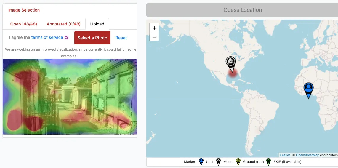
And a personal fave: the university-created Geolocation Estimation guesses the location of an image. In my tests, it was incredibly effective for images taken outside - not so much inside.
It’s been great chatting with you all and learning about what you want to learn. TFR will be off for the next issue, so see you in 2025!


